We made and invasive species website in e-Com this week. We used dreamweaver to create a website from scratch. We put in all the information and coded the website according to some informational videos. We got to chose out color palette and fonts. This website was made to increase invasive species awareness. If I had to do this project again I would keep the colors and fonts the same. I would change the logo background.
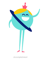
Summary The project I found is a collection of character animations, inspired by outer space, that express emotions. They were made for a google app and loop forever without any noticeable start or stop. There is an image of one of the characters but for the full post click here . Review Each character icon tells a short individual story. The icon for encouragement is two characters the sun and the earth. The sun nods and pats the earth on the head which makes it smile wider. Another small story is told in the confused icon which is a spaceship looking around. When it can't find anything it shrugs its shoulders then goes back to looking around. One element of these projects that I would apply to my own work is how the characters are constantly moving such as blinking, nodding, or bouncing which gives them a more realistic feel because people are never still. An element that I have already learned that is applied to this project is how to loop a video so it plays ...
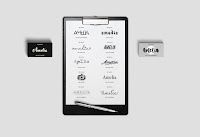
This semester I have learned a lot about graphic design. I have improved technical skills as well as my understanding of the concepts and rule of design. Name Typography The first project we did this year was a typography project where we took a characteristic of ourselves or something you liked and made your name represent that. This project lasted about three weeks. First we made a list of words or phrases that we wanted to use. Then we made three or four sketches for each. We then took the sketches into the computer and designed them. Next we critiqued our work and redesigned. During critiques I learned that I was the fonts I was using were too similar. One challenged I faced we trying to make all my designs unique and represent what I wanted without using graphics. Both the feedback and the challenges made me modify my work by removing excess graphics and finding more unique fonts. During this project I learned that typography is about putting meaning into the design of the...
Magazine For this project we interviewed a local designers and created a magazine spread that reflected their design style while incorporating our own elements. This project took about two months to complete from concepts and interview to the final project. A challenge I faced in this project was never having designed a print layout before, this made it difficult to figure out how to set up the information. From this struggle I learned how to design print layouts but I also learned hot to think creatively with type and graphics together without overwhelming the viewer. Some feedback I was given at our first critique fed into this because I was told that I did not have a good ratio of original design elements to designer’s elements in the spread. I then added much more of my own design to create a unique piece. Overall I was very happy with the outcome of this project, I spent many hours outside of class perfecting it an I believe it reflects some of my best work. Pr...
Comments
Post a Comment